data.json Reference
data.json defines what data to populate a PowerPoint template with, and is one of the required elements of SlidePack's input zip file.
This page is a reference of different types of objects that you can use in data.json.
For more concrete examples of how to use them, please refert to Examples.
The root object
This is how the data.json top level object should be shaped.
Attributes
- Name
slides- Type
- object[]
- Required?
- Yesrequired
- Description
- An array of Slide objects. Each will result in a single slide in the output PPTX. Multiple Slide objects may point to the same template slide number, in which case that template slide will be reused multiple times.
- Name
theme- Type
- object
- Required?
- No
- Description
- A Theme object that applies to the whole PPTX presentation.
Older versions of the API accepted JSON with the slides array at root. This format is still supported, but is scheduled to be deprecated in the next version.
The data.json root object
{
  "slides": [
    {
      "template": 1,
      "some_text": "Text to place"
    },
    {
      "template": 2,
      "some_table": {
        "type": "table",
        "rows": [
          ["this", "is", "header"],
          ["this", "is", "first row"]
        ]
      }
    }
  ],
  "theme": {
    "colors": {
      "dk1": "#6c685f",
      "lt1": "#f5f2e3"
    }
  }
}
The Slide object
Each Slide object will result in a single slide in the rendered pptx file.
A Slide object is a mapping of placeholder keys to item data.
For each key, SlidePack will look for a corresponding placeholder in the slide and try to fill it with the provided value.
The template key is required and specifies which slide in the template PowerPoint
should be used as the template for this slide.
Attributes
- Name
template- Type
- integer
- Required?
- Yesrequired
- Description
- The template slide number to use.
The Slide object
{
  "template": 1,
  "my_text": "Text to place",
  "more_text": {
    "type": "text",
    "value": "More text to place",
    "hyperlink": "https://slidepack.io/"
  },
  "my_table": {
    "type": "table",
    "rows": [
      ["This", "is", "the header"],
      ["This", "is", "the first row"]
    ]
  }
}
The Text object
The Text object is used to represent a piece of text.
It can be used:
- To replace {placeholders} in text boxes with the provided value.
- To place text in a table cell.
- As a list item.
String shorthand
You can use a plain string in place of a Text object when no additional options are needed.
"my_text": "Lorem ipsum dolor sit amet."
is equivalent to:
"my_text": {
  "type": "text",
  "value": "Lorem ipsum dolor sit amet."
}
Attributes
- Name
type- Type
- string "text"
- Required?
- Yesrequired
- Description
- Name
value- Type
- string
- Required?
- Yesrequired
- Description
- The text content value.
- Name
styles- Type
- object
- Required?
- No
- Description
- A Styles object. Specified values will be used to override existing styles.
styles.fontapplies to the text value.styles.shapeapplies to the containing shape.
- Name
hyperlink- Type
- string
- Required?
- No
- Description
- The text will link to this URL if specified.
- Name
level- Type
- integer
- Required?
- No
- Description
Indent level of this text block within a list. Minimum is
0(default), maximum is8. Only applicable if this Text object is part of a List object.
The Text object (minimum example)
"my_placeholder": {
  "type": "text",
  "value": "Lorem ipsum dolor sit amet."
}
The Text object (with more options)
"my_placeholder": {
  "type": "text",
  "value": "Lorem ipsum dolor sit amet.",
  "styles": {
    "font": {
      "size": 28,
      "color": "#000000",
      "underline": true,
      "italic": true
    },
    "shape": {
      "fill": "#E2E9F4",
      "outline": "758AA5",
      "align": "center",
      "vertical_align": "top"
    }
  },
  "hyperlink": "https://slidepack.io/"
}
The Table object
The Table object is used to populate a table with tabular data.
SlidePack will look for tables that have the key as its alt text. In PowerPoint, right click on a table and select View alt text to change a table's alt text.
Each cell value may be a Text object or a string shorthand.
Columns and rows will be added or removed to match the dimensions of the provided array.
Attributes
- Name
type- Type
- string "table"
- Required?
- Yesrequired
- Description
- Name
rows- Type
- string[][] or object[][]
- Required?
- Yesrequired
- Description
2-dimensional array of cell values. Cell values may be a mixture of Text objects and string shorthands.
- Name
rows[n][m]- Type
- string or object
- Required?
- No
- Description
Cell value at row n, column m.
- Name
rows[n][m].databar- Type
- object
- Required?
- No
- Description
A data bar will be drawn in the cell if specified.
- Name
rows[n][m].databar.ratio- Type
- number
- Required?
- No
- Description
Length of the data bar, within range
0.0to1.0.
- Name
rows[n][m].databar.color- Type
- number
- Required?
- No
- Description
Color of the data bar.
- Name
horizontal_sizing- Type
- string enum
- Required?
- No
- Description
Specifies how the table resizes horizontally when columns are added or removed.
fixed(default) - Keep the original table width. Column widths are adjusted to fit.anchor_left- Keep the left side of the table in place. Table resizes to the right if necessary.anchor_right- Keep the right side of the table in place. Table resizes to the left if necessary.
- Name
vertical_sizing- Type
- string enum
- Required?
- No
- Description
Specifies how the table resizes vertically when rows are added or removed.
fixed- Keep the original table height. Row heights are adjusted to fit.anchor_top(default) - Keep the top side of the table in place. Table resizes downwards if necessary.anchor_bottom- Keep the bottom side of the table in place. Table resizes upwards if necessary.
The Table object (minimum example)
"my_table_alt_text": {
  "type": "table",
  "rows": [
    ["Title", "Artist", "Album"],
    ["So What", "Miles Davis", "Kind of Blue"],
    ["Take Five", "Dave Brubeck", "Time Out"]
  ]
}
The Table object (with more options)
"my_table_alt_text": {
  "type": "table",
  "rows": [
    ["Title", "Artist", "Album"],
    [
      {
        "type": "text",
        "value": "So What",
        "styles": {
          "font": {
            "bold": true
          },
          "shape": {
            "align": "justified"
          }
        }
      },
      { "type": "text", "value": "Miles Davis" },
      { "type": "text", "value": "Kind of Blue" }
    ],
    [
      { "type": "text", "value": "Take Five" },
      { "type": "text", "value": "Dave Brubeck" },
      { "type": "text", "value": "Time Out" }
    ]
  ],
  "horizontal_sizing": "fixed",
  "vertical_sizing": "anchor_top"
}
The Chart object
The Chart object is used to populate a chart with series data.
Currently supported chart types are Bar, Line, Area and Pie.
Scatter charts are also supported, but the data format is slightly different.
SlidePack will look for charts that have the key as its alt text. In PowerPoint, right click on a chart and select View alt text to change a chart's alt text.
Attributes
- Name
type- Type
- string "chart"
- Required?
- Yesrequired
- Description
- Name
labels- Type
- string[]
- Required?
- No
- Description
Array of strings that are displayed as category labels. These are usually displayed on the horizontal axis.
- Name
labels_interval- Type
- integer
- Required?
- No
- Description
Display interval of string category labels. For example,
3would mean one in every three oflabelsare actually displayed, and the rest are skipped.
- Name
date_labels- Type
- integer[]
- Required?
- No
- Description
Array of numerical values that are displayed as category labels. Specify this instead of
labelsto use the "Date axis" format. Values are Excel date values: integers that denote the number of days since Jan 1, 1900. For example, November 11, 2022 is44881.
- Name
date_labels_format- Type
- string
- Required?
- No
- Description
Format code for date axis category labels. An example is
"yyyy/mm/dd". Refer to MS Office documents for format code details.
- Name
date_labels_major_unit- Type
- int
- Required?
- No
- Description
Display interval of date axis category labels. Combine with
date_labels_major_time_unit. For example,2and"months"means an interval of 2 months.
- Name
date_labels_major_time_unit- Type
- string enum
- Required?
- No
- Description
One of
"days","months", or"years".
- Name
axis1- Type
- object
- Required?
- Yesrequired
- Description
Data for the primary value axis.
- Name
axis1.series- Type
- object
- Required?
- Yesrequired
- Description
Map of series keys to series data objects.
- Name
axis1.series.{key}- Type
- object
- Required?
- Yesrequired
- Description
Series data. If the key exists as a series name in the template chart, that series will be overwritten. Otherwise, a new series will be created.
- Name
axis1.series.{key}.name- Type
- string
- Required?
- Yesrequired
- Description
New name for the series. This name may appear, for example, in the chart legend.
- Name
axis1.series.{key}.values- Type
- number[]
- Required?
- Yesrequired
- Description
Array of series data point values.
- Name
axis1.series.{key}.styles- Type
- object
- Required?
- No
- Description
A Styles object for the whole series.
- Name
axis1.series.{key}.data_point_styles- Type
- object[]
- Required?
- No
- Description
Array of Styles objects for individual data points. Each styles object applies to the data point in the same position in the
valuesarray. Usenullelements to keep default styles.
- Name
axis1.bounds- Type
- object
- Required?
- No
- Description
Display range of the value axis.
- Name
axis1.bounds.minimum- Type
- number
- Required?
- No
- Description
Minimum display value of the axis.
- Name
axis1.bounds.maximum- Type
- number
- Required?
- No
- Description
Maximum display value of the axis.
- Name
axis1.format- Type
- string
- Required?
- No
- Description
Format code for value axis labels. Examples are
"0.0%"and"#,#0.0". Refer to MS Office documents for format code details.
- Name
axis1.major_unit- Type
- number
- Required?
- No
- Description
Display interval of value axis labels.
- Name
axis2- Type
- object
- Required?
- No
- Description
Data for the secondary value axis. Schema is identical to
axis1.
Effects of styles and data_point_styles
shape.fill | shape.outline | |
|---|---|---|
| Bar chart | Bar fill | Bar outline |
| Line chart | Marker fill | Plot line and marker outline |
| Area chart | Area fill | Area outline |
The Chart object (minimum example)
"my_chart_alt_text": {
  "type": "chart",
  "labels": ["Q1", "Q2", "Q3", "Q4"],
  "axis1": {
    "series": {
      "my_series_key": {
        "name": "Revenue",
        "values": [100, 130, 120, 130]
      }
    }
  }
}
The Chart object (with more options)
"my_chart_alt_text": {
  "type": "chart",
  "labels": ["Q1", "Q2", "Q3", "Q4"],
  "labels_interval": 2,
  "axis1": {
    "bounds": {
      "minimum": 50,
      "maximum": 150
    },
    "format": "#,#.0",
    "interval": 20,
    "series": {
      "ser1": {
        "name": "Revenue",
        "values": [100, 130, 120, 130]
      },
      "ser2": {
        "name": "Expenses",
        "values": [85, 90, 80, 75]
      }
    }
  },
  "axis2": {
    "series": {
      "ser3": {
        "name": "Gross profit margin",
        "values": [0.15, 0.3, 0.33, 0.42],
        "styles": {
          "shape": { "fill": "ffdd99", "outline": "ffaa55" }
        },
        "data_point_styles": [
          null,
          null,
          { "shape": { "fill": "ff0000" } },
          null
        ]
      }
    }
  }
}
The Scatter Chart object
The Scatter Chart object is used to populate a scatter chart with series data.
SlidePack will look for charts that have the key as its alt text. In PowerPoint, right click on a chart and select View alt text to change a chart's alt text.
Attributes
- Name
type- Type
- string "scatter-chart"
- Required?
- Yesrequired
- Description
- Name
axis1- Type
- object
- Required?
- Yesrequired
- Description
Data for the primary axis.
- Name
axis1.series- Type
- object
- Required?
- Yesrequired
- Description
Map of series keys to series data objects.
- Name
axis1.series.{key}- Type
- object
- Required?
- No
- Description
Series data. If the key exists as a series name in the template chart, that series will be overwritten. Otherwise, a new series will be created.
- Name
axis1.series.{key}.name- Type
- string
- Required?
- Yesrequired
- Description
New name for the series. This name may appear, for example, in the chart legend.
- Name
axis1.series.{key}.values- Type
- [number, number][]
- Required?
- Yesrequired
- Description
Array of series data point values. Each element is a tuple
[x, y]that represents a data point.
- Name
axis1.series.{key}.styles- Type
- object
- Required?
- No
- Description
A Styles object for the whole series.
- Name
axis1.series.{key}.data_point_styles- Type
- object[]
- Required?
- No
- Description
Array of Styles objects for individual data points. Each styles object applies to the data point in the same position in the
valuesarray. Usenullelements to keep default styles.
- Name
axis1.x_bounds- Type
- object
- Required?
- No
- Description
Display range of the X axis.
- Name
axis1.x_bounds.minimum- Type
- number
- Required?
- No
- Description
Minimum display value of the X axis.
- Name
axis1.x_bounds.maximum- Type
- number
- Required?
- No
- Description
Maximum display value of the X axis.
- Name
axis1.x_format- Type
- string
- Required?
- No
- Description
Format code for the X axis labels. Examples are
0.0%and#,#0.0. Refer to MS Office documents for format code details.
- Name
axis1.x_major_unit- Type
- number
- Required?
- No
- Description
Display interval of labels of the X axis labels.
- Name
axis1.y_bounds- Type
- object
- Required?
- No
- Description
Display range of the Y axis.
- Name
axis1.y_bounds.minimum- Type
- number
- Required?
- No
- Description
Minimum display value of the Y axis.
- Name
axis1.y_bounds.maximum- Type
- number
- Required?
- No
- Description
Maximum display value of the Y axis.
- Name
axis1.y_format- Type
- string
- Required?
- No
- Description
Format code for the Y axis labels. Examples are
0.0%and#,#0.0. Refer to MS Office documents for format code details.
- Name
axis1.y_major_unit- Type
- number
- Required?
- No
- Description
Display interval of labels of the Y axis labels.
- Name
axis2- Type
- object
- Required?
- No
- Description
Data for the secondary value axis data. Schema is identical to
axis1.
The Scatter chart object (minimum example)
"my_scatter_chart_alt_text": {
  "type": "scatter-chart",
  "axis1": {
    "series": {
      "my_series_key": {
        "name": "Occurences",
        "values": [
          [7.1, 5.1],
          [3.4, 6.9],
          [2.6, 2.6],
          [4.0, 8.1],
          [2.8, 4.5]
        ]
      }
    }
  }
}
The Chart object (with more options)
"my_scatter_chart_alt_text": {
  "type": "scatter-chart",
  "axis1": {
    "x_bounds": { "minimum": 0, "maximum": 10 },
    "x_format": "#,#0.00",
    "x_major_unit": 1.0,
    "y_bounds": { "minimum": 0, "maximum": 10 },
    "series": {
      "my_series_one": {
        "name": "Natural",
        "values": [
          [7.1, 5.1],
          [3.4, 6.9],
          [2.6, 2.6],
          [4.0, 8.1],
          [2.8, 4.5]
        ]
      }
    }
  },
  "axis2": {
    "series": {
      "my_series_two": {
        "name": "Synthetic",
        "values": [
          [4.6, 5.3],
          [5.2, 3.6],
          [6.0, 2.8],
          [6.3, 6.5],
          [8.2, 4.4]
        ],
        "styles": {
          "shape": { "fill": "ffdd99", "outline": "ffaa55" }
        },
        "data_point_styles": [
          null,
          null,
          { "shape": { "fill": "ff0000" } },
          null,
          null
        ]
      }
    }
  }
}
The List object
The List object is used to populate a list with list items.
SlidePack will look for {placeholders} in text boxes and replace it with a list.
values[n].styles.font can be used to change font styles, but values[n].styles.shape is ignored.
Attributes
- Name
type- Type
- string "list"
- Required?
- Yesrequired
- Description
- Name
values- Type
- string[] or object[]
- Required?
- Yesrequired
- Description
List items. May be a mixture of Text objects and string shorthands.
- Name
values[n].level- Type
- integer
- Required?
- No
- Description
Indent level. Minimum (default) is
0, max is8.
The List object (minimum example)
"my-list-placeholder": {
  "type": "list",
  "values": [
    "Lorem ipsum dolor sit amet",
    "consectetur adipiscing elit",
    "Sed mollis pretium"
  ]
}
The List object (with more options)
"my-list-placeholder": {
  "type": "list",
  "values": [
    {
      "value": "Lorem ipsum dolor sit amet",
      "level": 1
    },
    {
      "value": "consectetur adipiscing elit",
      "level": 2
    },
    {
      "value": "Sed mollis pretium",
      "level": 2,
      "styles": {
        "font": {
          "bold": true,
          "color": "#2a4598"
        }
      }
    }
  ]
}
The Image object
The Image object is used to embed an image.
SlidePack will look for {placeholders} in shapes and replace it with an image.
Attributes
- Name
type- Type
- string "image"
- Required?
- Yesrequired
- Description
- Name
src- Type
- string
- Required?
- Yesrequired
- Description
Include your image file in the zip archive, and specify the relative path from the directory
data.jsonis in. Supported image formats arejpg,jpeg,gif, andpng.
- Name
scaling- Type
- string enum
- Required?
- No
- Description
Specifies how the image should be scaled.
none(default) - Use the image intrinsic size.contain- Scale so that the entire image fits within the target shape.cover- Scale so that the image fills the target shape. Image may overflow.
- Name
overflow- Type
- string enum
- Required?
- No
- Description
Specifies how overflow should be treated.
visible(default) - Image is not clipped, and may overflow the target shape.hidden- Image is clipped at the target shape bounds.
The Image object
  "my-image-placeholder": {
    "type": "image",
    "src": "images/home-office.jpg",
    "scaling": "contain",
    "overflow": "hidden"
  }
The Video object
The Video object is used to embed a video.
SlidePack will look for {placeholders} in shapes and replace it with a video.
Video may be unplayable if it uses a codec that PowerPoint does not support. Microsoft recommends H.264 video and AAC audio.
Attributes
- Name
type- Type
- string "video"
- Required?
- Yesrequired
- Description
- Name
src- Type
- string
- Required?
- Yesrequired
- Description
A local video file path or a YouTube URL. For local videos, include your video file in the zip archive, and specify the relative path from the directory
data.jsonis in. Supported file formats aremp4,m4v, andmov.
- Name
thumbnail- Type
- string
- Required?
- No
- Description
Picture to be shown when video is not playing. Required for local video files. Needs to have the same aspect ratio as the video itself. Include your image file in the zip archive, and specify the relative path from the directory
data.jsonis in. Supported file formats arejpg,jpeg,pngandgif.
- Name
scaling- Type
- string enum
- Required?
- No
- Description
Specifies how the video should be scaled.
contain(default) - Scale so that the entire video fits within the target shape.cover- Scale so that the video fills the target shape. Video may overflow.
The Video object
  "my-video-placeholder": {
    "type": "video",
    "src": "demo-reel.mp4",
    "thumbnail": "thumb.png",
    "scaling": "contain"
  }
The Styles object
The Styles object is used to apply colors and font styles to objects.
The effects vary depending on what type of object the styles are being applied to.
For example, when applied to a Text object, shape.outline changes the outline color of the shape that the text is in.
When applied to a bar Chart series, it changes the outline color of the bars.
Some properties do not have an effect when applied to a certain type of object.
For example, shape.align is ignored for a chart data point.
See reference entries for each object type and the examples for details.
Attributes
- Name
font- Type
- object
- Required?
- No
- Description
Font styles.
- Name
font.typeface- Type
- string
- Required?
- No
- Description
Changes the text font typeface. Examples are
"Arial"and"Calibri".
- Name
font.size- Type
- number
- Required?
- No
- Description
Changes the text font size, in points.
- Name
font.color- Type
- string
- Required?
- No
- Description
Changes the text color.
- Name
font.underline- Type
- boolean
- Required?
- No
- Description
Applies underline.
- Name
font.bold- Type
- boolean
- Required?
- No
- Description
Applies bold.
- Name
font.italic- Type
- boolean
- Required?
- No
- Description
Applies italic.
- Name
font.strike- Type
- boolean
- Required?
- No
- Description
Applies strike-through.
- Name
shape- Type
- object
- Required?
- No
- Description
Shape styles.
- Name
shape.outline- Type
- string
- Required?
- No
- Description
Changes the shape outline color.
- Name
shape.fill- Type
- string
- Required?
- No
- Description
Changes the shape fill color.
- Name
shape.align- Type
- string enum
- Required?
- No
- Description
Changes the horizontal alignment of text within the shape. One of
left,center,right,justifiedordistributed.
- Name
shape.vertical_align- Type
- string enum
- Required?
- No
- Description
Changes the vertical alignment of text within the shape. One of
top,centerorbottom.
Text object with Styles
"my-text-placeholder": {
  "type": "text",
  "value": "Lorem ipsum dolor sit amet",
  "styles": {
    "font": {
      "typeface": "Times New Roman",
      "size": 28,
      "color": "#000000",
      "underline": true,
      "italic": true,
      "bold": true,
      "strike": true
    },
    "shape": {
      "outline": "accent1",
      "fill": "lavender",
      "align": "center",
      "vertical_align": "bottom"
    }
  }
}
The Theme object
The Theme object is used to change theme colors that apply to all slides in the presentation.
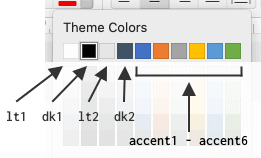
A PowerPoint theme has 12 named colors:

You can specify each of them with a Color string.
Use hex codes such as "#ff0000" or color names such as "snow".
Theme color names such as "dk1" cannot be used to define theme colors.
Unspecified colors and ones set to empty strings "" or null retain their original colors.
Attributes
- Name
colors- Type
- object
- Required?
- No
- Description
Color values.
- Name
colors.lt1- Type
- string
- Required?
- No
- Description
Color for "Text/Background - Light 1". This is usually the slide background.
- Name
colors.dk1- Type
- string
- Required?
- No
- Description
Color for "Text/Background - Dark 1". This is usually the text color.
- Name
colors.lt2- Type
- string
- Required?
- No
- Description
- Color for "Text/Background - Light 2".
- Name
colors.dk2- Type
- string
- Required?
- No
- Description
- Color for "Text/Background - Dark 2".
- Name
colors.accent1- Type
- string
- Required?
- No
- Description
- Color for "Accent 1".
- Name
colors.accent2- Type
- string
- Required?
- No
- Description
- Color for "Accent 2".
- Name
colors.accent3- Type
- string
- Required?
- No
- Description
- Color for "Accent 3".
- Name
colors.accent4- Type
- string
- Required?
- No
- Description
- Color for "Accent 4".
- Name
colors.accent5- Type
- string
- Required?
- No
- Description
- Color for "Accent 5".
- Name
colors.accent6- Type
- string
- Required?
- No
- Description
- Color for "Accent 6".
- Name
colors.hlink- Type
- string
- Required?
- No
- Description
- Color for "Hyperlink".
- Name
colors.folHlink- Type
- string
- Required?
- No
- Description
- Color for "Followed Hyperlink".
Theme object
{
  "colors": {
    "lt1": "F5F2E3",
    "dk1": "6c685f",
    "lt2": "#CAD9EA",
    "dk2": "#5c6875",
    "accent1": "6b95a4",
    "accent2": "c9747f",
    "accent3": "7e9a62",
    "accent4": "tan",
    "accent5": "",
    "accent6": null,
    "hlink": "858499"
  }
}
Deleting elements
Assigning { "delete": true } to a placeholder key will delete that object from the slide.
Deleting objects from a slide
"my_placeholder": {
  "delete": true
}
- All text boxes containing the placeholder will be deleted.
- All table cells containing the placeholder will be emptied.
- All tables and charts with matching alt text will be deleted.
Colors
Specify colors for fonts, fills, etc. using Hex codes or color names.
Hex color codes look like #f6ad5c or FF0000.
The leading # is optional.
Hex color codes are case-insensitive.
Color names can be lt1, dk1, lt2, dk2, accent1, accent2, accent3, accent4, accent5, accent6, hlink, or folHlink.
They correspond to the 12 named colors defined in the theme and can be customized.
The following color names are available as well. They are similar to HTML color names, but please note that there are subtle differences such as "dark" vs "dk". These color names are case sensitive.