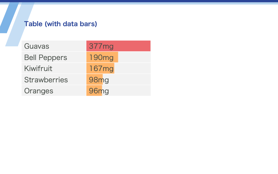
Table data bars
Draw data bars (bar-chart like bars) in table cells by specifying the databar option.
rows[n][m].databar.ratio sets the length of the data bar. Use a number value between 0.0 and 1.0.
rows[n][m].databar.color sets the color of the data bar.
Reference: the Table object
Download: input.zip · output.pptx
template.pptx
1
output.pptx
1
data.json
{
  "slides": [
    {
      "template": 1,
      "table1": {
        "type": "table",
        "rows": [
          [
            "Guavas",
            {
              "value": "377mg",
              "databar": {
                "ratio": 1.0,
                "color": "ec696d"
              }
            }
          ],
          [
            "Bell Peppers",
            {
              "value": "190mg",
              "databar": {
                "ratio": 0.50,
                "color": "ffb469"
              }
            }
          ],
          [
            "Kiwifruit",
            {
              "value": "167mg",
              "databar": {
                "ratio": 0.44,
                "color": "ffb469"
              }
            }
          ],
          [
            "Strawberries",
            {
              "value": "98mg",
              "databar": {
                "ratio": 0.26,
                "color": "ffb469"
              }
            }
          ],
          [
            "Oranges",
            {
              "value": "96mg",
              "databar": {
                "ratio": 0.25,
                "color": "ffb469"
              }
            }
          ]
        ]
      }
    }
  ]
}